Coffee, fun flavors, and fun branding galore. My first responsibility during my contract time at Crazy Cups was to help create a brand new, refreshed website for their coffee products. Did I mention this was all needed to be completed in under one month? Challenge accepted.
Although the main platform we were using for this new site was Shopify, I needed to add some custom touches. I dove deep into the HTML/CSS world and got to work. I also created new graphics through Illustrator, Photoshop, XD, Dimension, After Effects, and I also took some product photos myself. In under 4 weeks, a new website was born.
Below are screenshots and snippets of the older website:
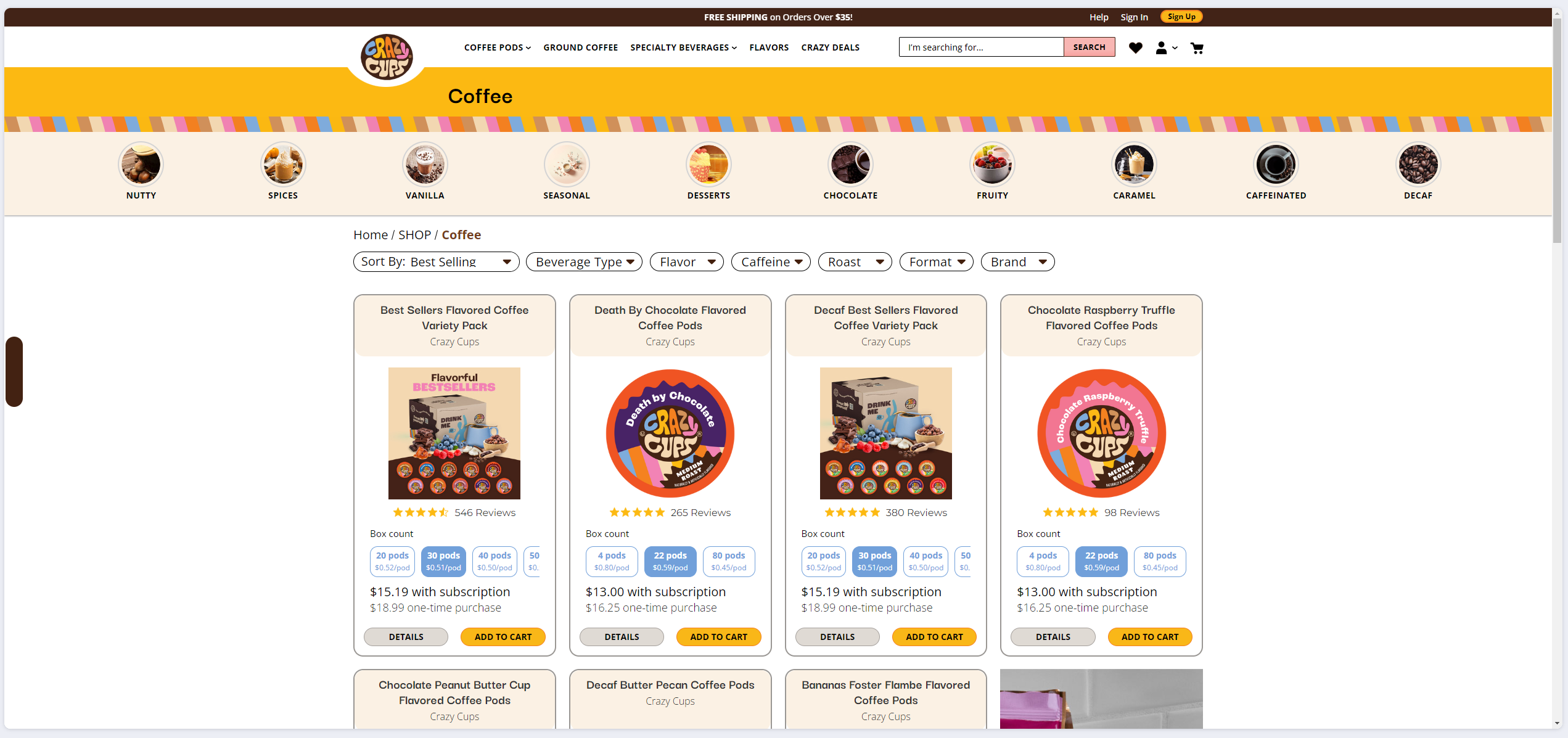
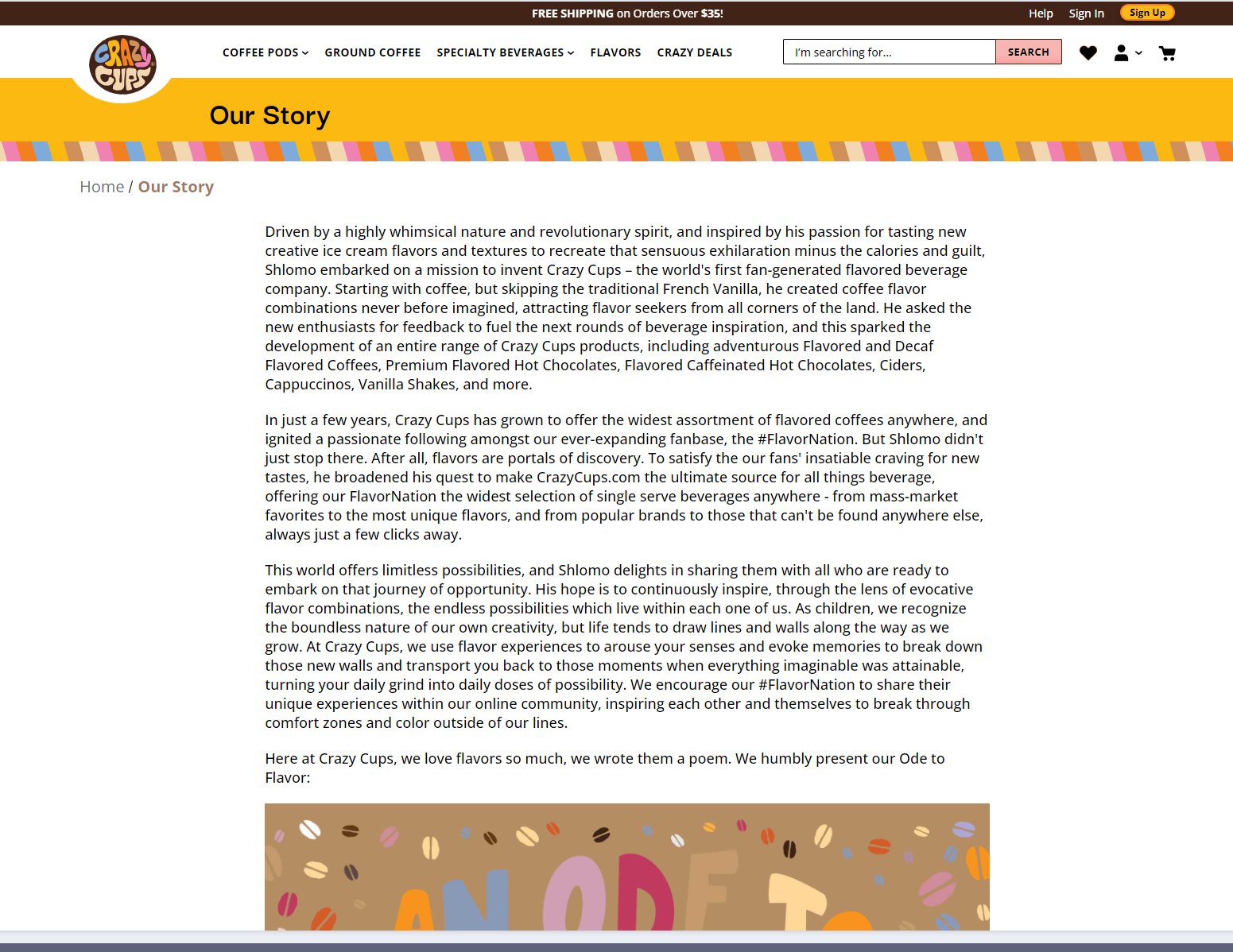
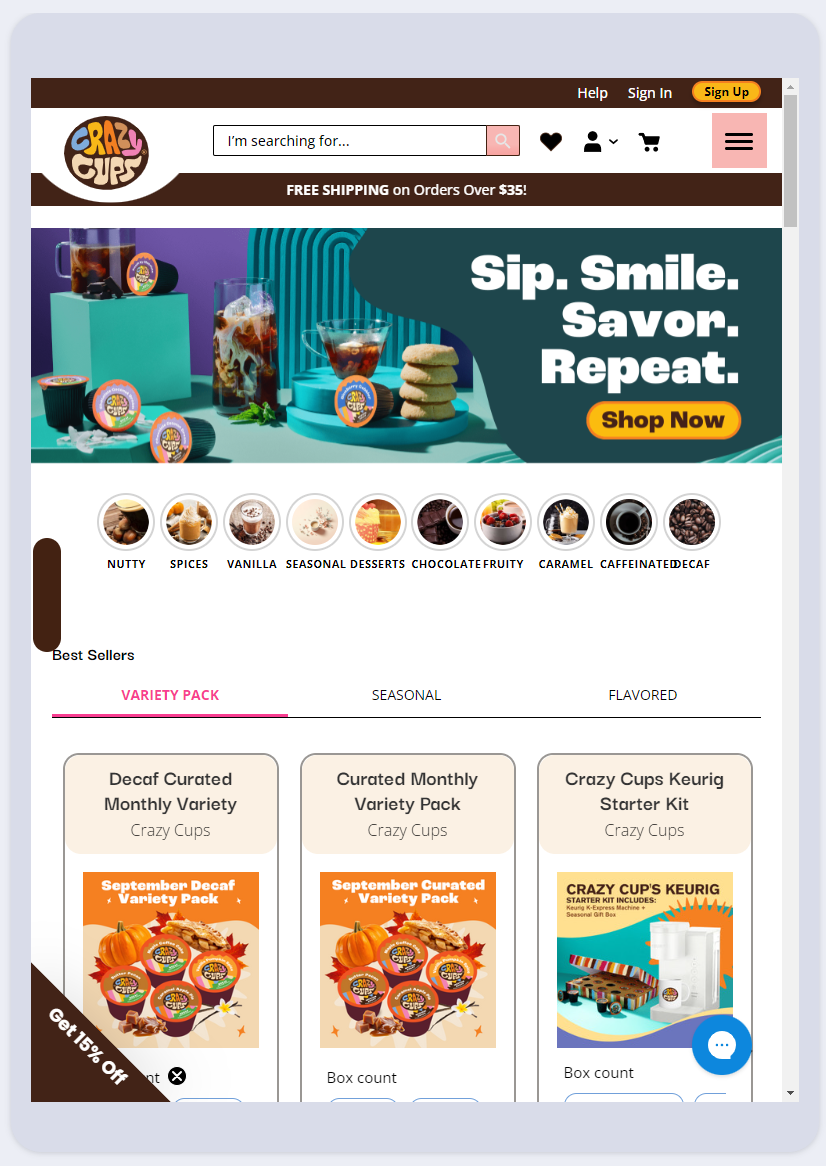
Screenshots of the old website
As you can see from the start, we had a mixture of old and new branding that was clashing. The outdated, heavily custom-coded UI was in urgent need of a face lift. The homepage did showcase some good photography at the top, but nonetheless it needed some updating as well.
The brand guidelines for Crazy Cups are a fun, bright, and clean, with a crazy twist here and there. I really wanted to bring this website out of the 90's and into something anybody online would have a lot of fun simply visiting (and hopefully buying a flavored coffee or two).
I met with the original branding company who gave Crazy Cups a rebrand in the first place, and gathered existing assets from them as well to make sure we didn't steer too far from the old website, but just enough to give it a fresh new look and feel.
Below are screenshots of the new website:
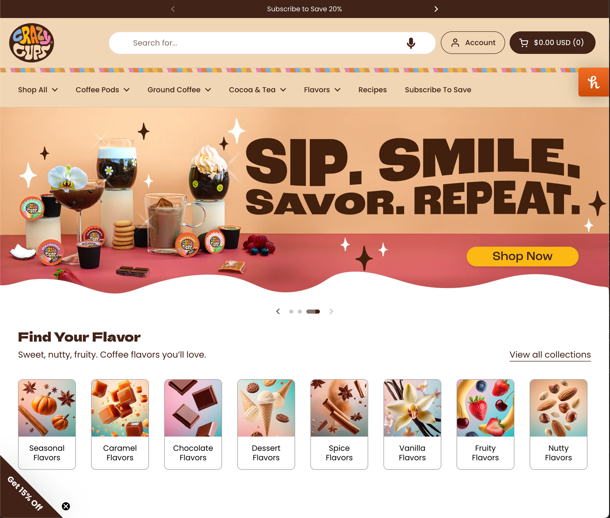
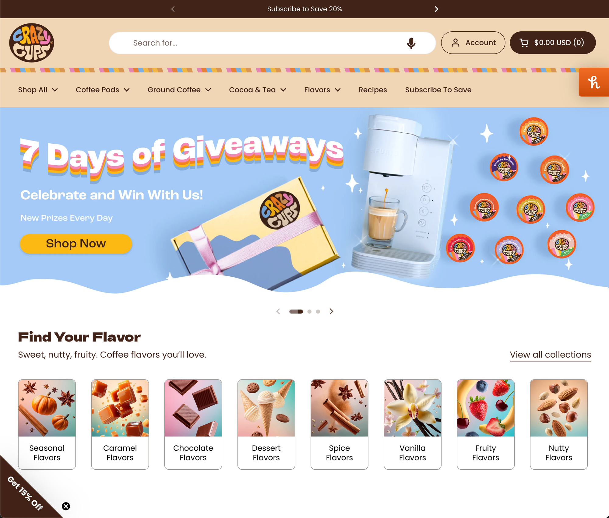
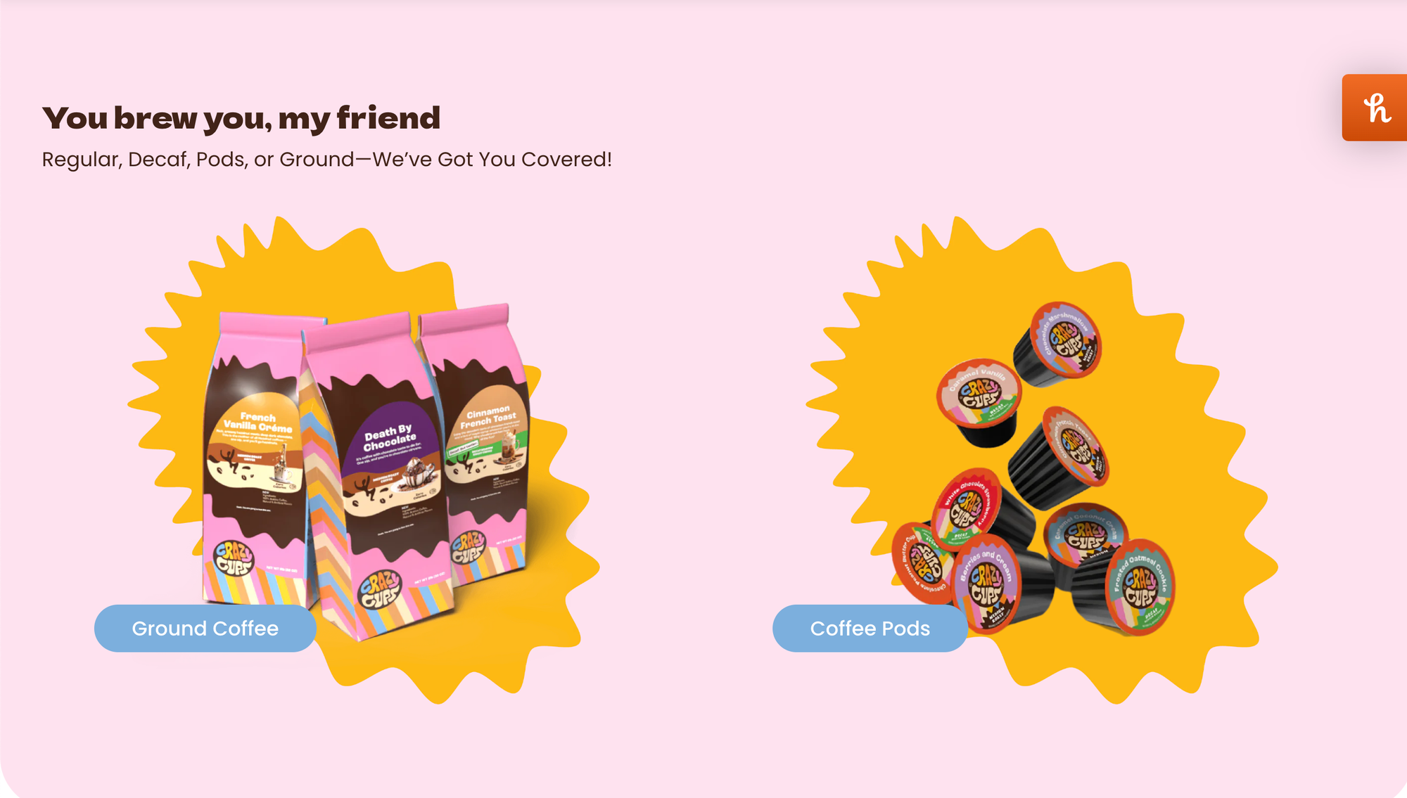
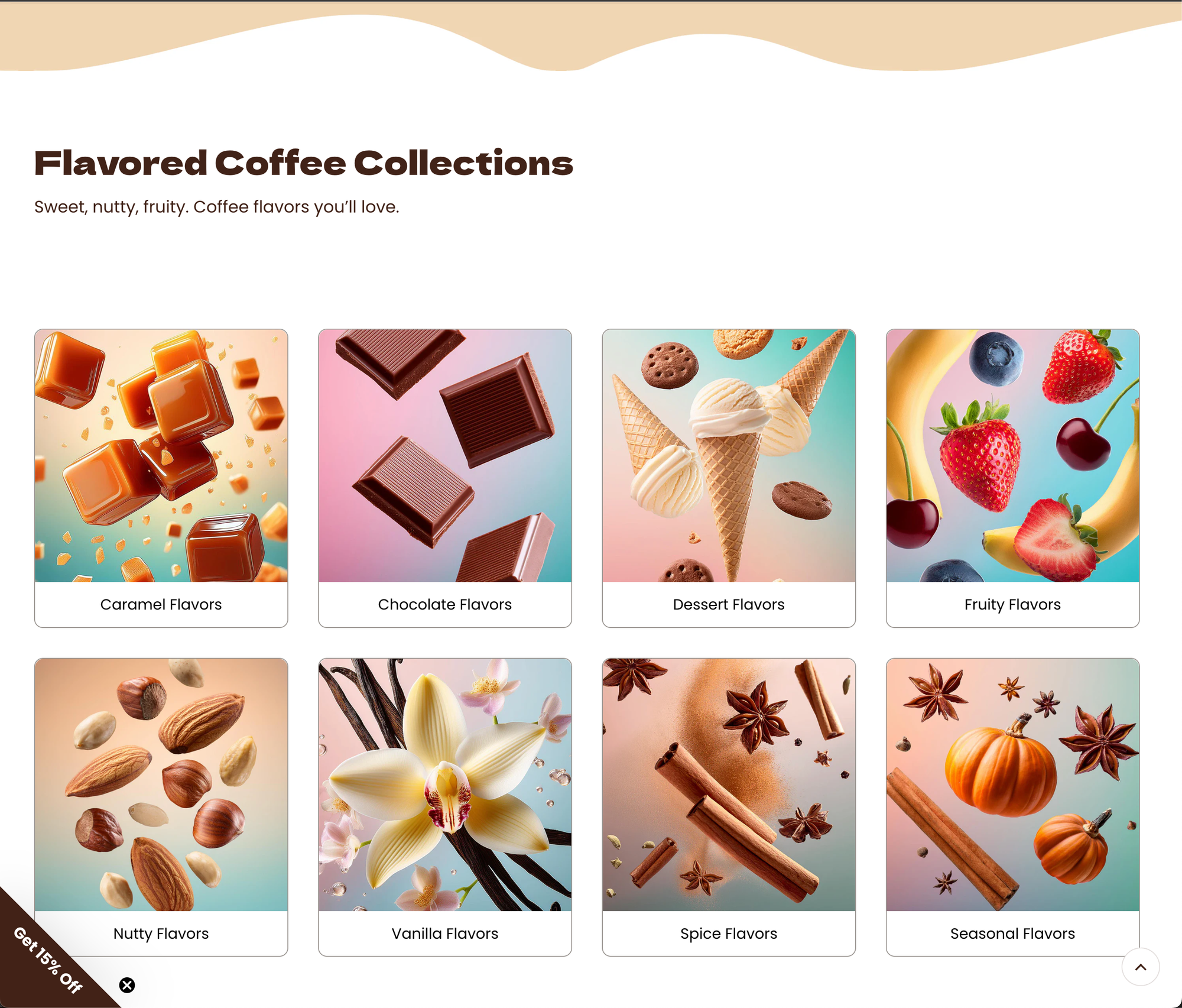
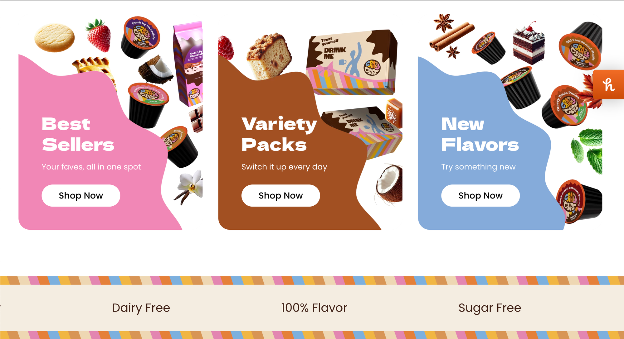
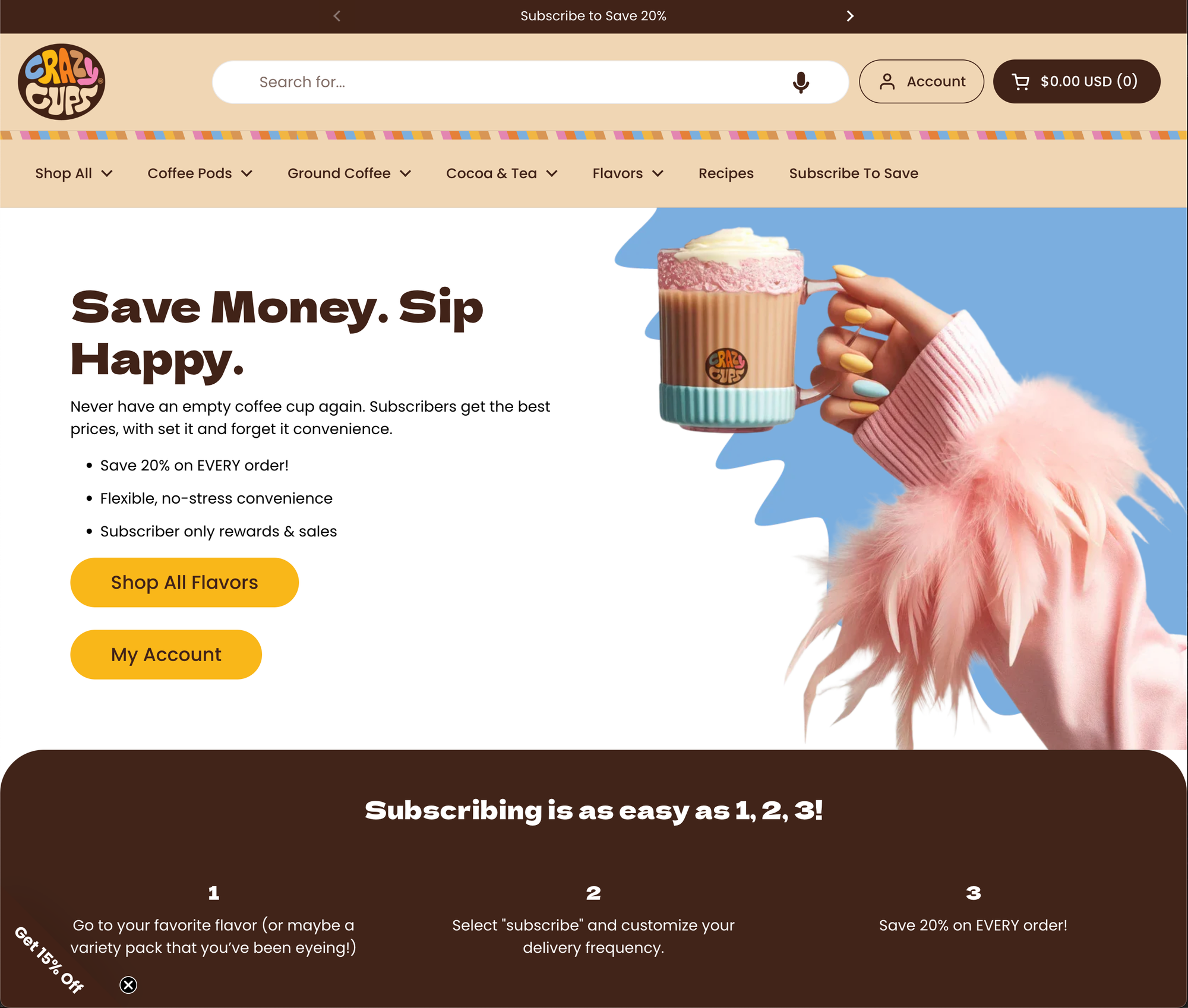
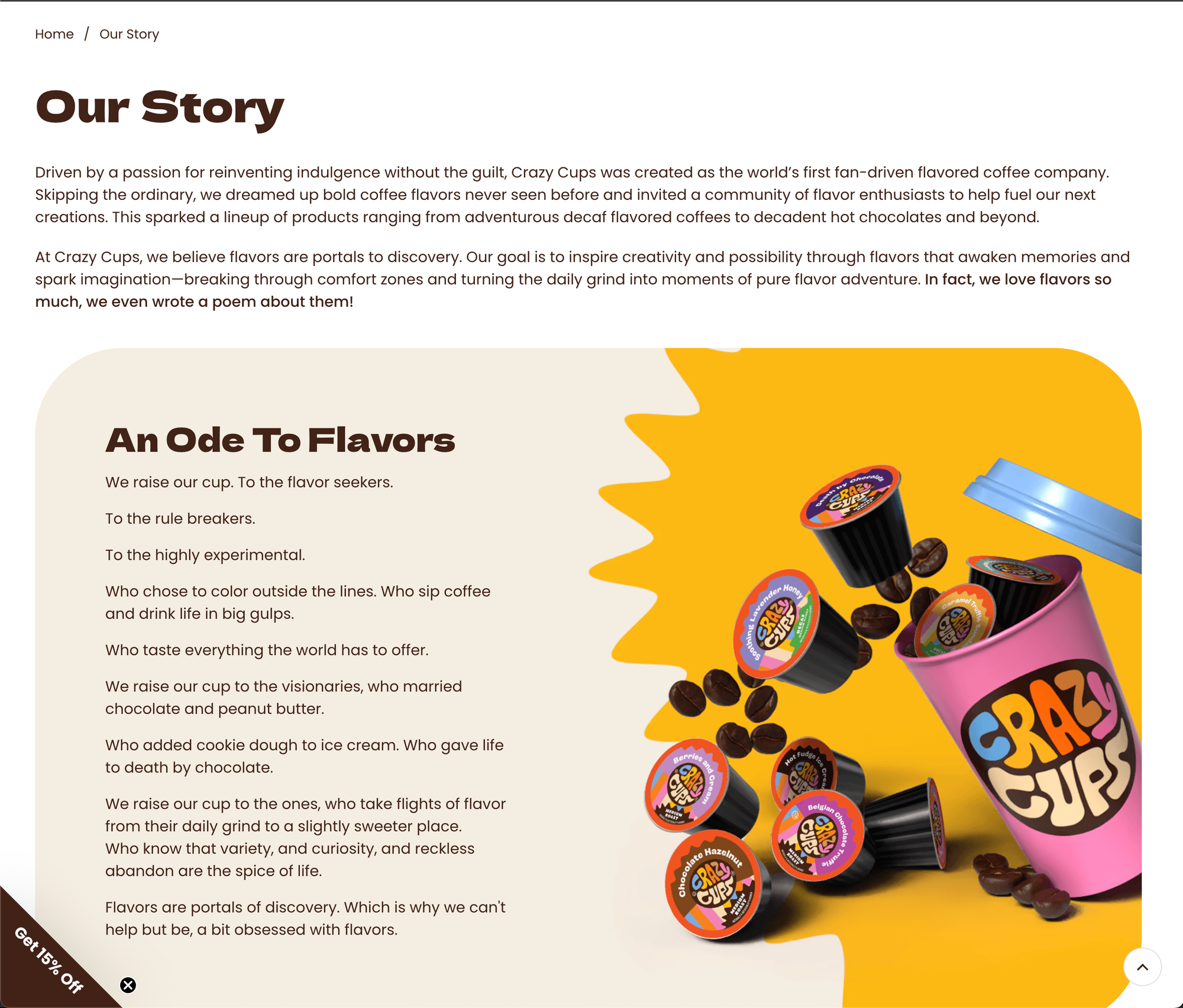
Nothing truly beats the real experience of the website though. In order to see it in full action, click here to view the webpage!
