One of my very first tasks when I joined the Lone Peak Dental Group team was to aid in rebranding a dental practice they had recently purchased. The main goal was to keep the name similar to what it was originally, but their logo had to go. This was quite a challenge, especially because I had to stick to two different branding guidelines — one for Lone Peak's Kidsperience brand, and one for Pearls 4 Kids, the practice's name.
Although Lone Peak had a 3rd party graphic designer that handled the majority of their design projects, my boss at the time knew I had the skill and the speed to create a logo that everyone loved. As always, I put my heart and soul into every design I create, and I believe the following projects truly showcase my flexibility in my design work. My main aesthetic is clean, modern, and airy, but Lone Peak's Kidsperience branding is playful, child-like, and a little quirky.
Please see my design process below:
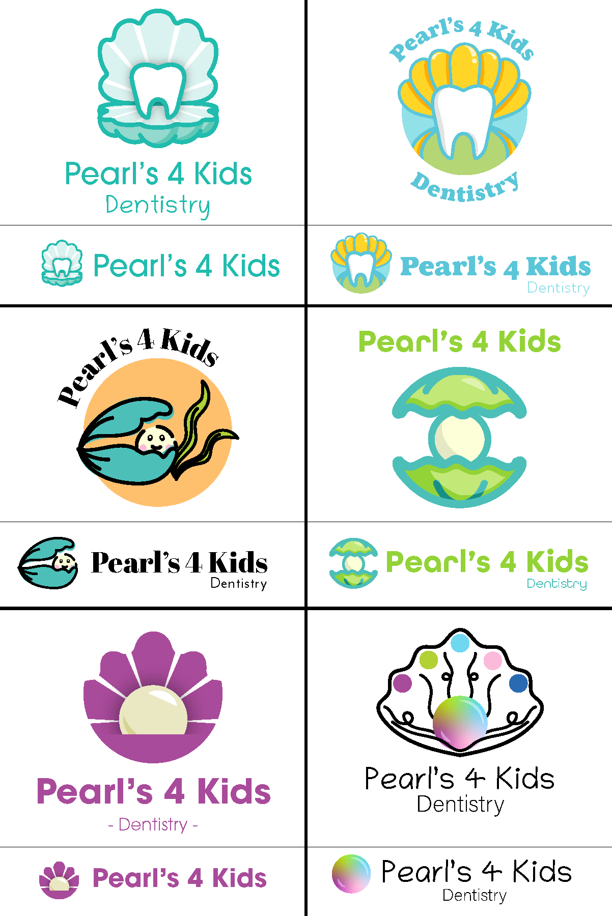
- First Iteration - A collection of 6 starting designs with various treatments presented to everyone involved, to see what direction I should focus on. Their main goal was to have a tooth act as a pearl.
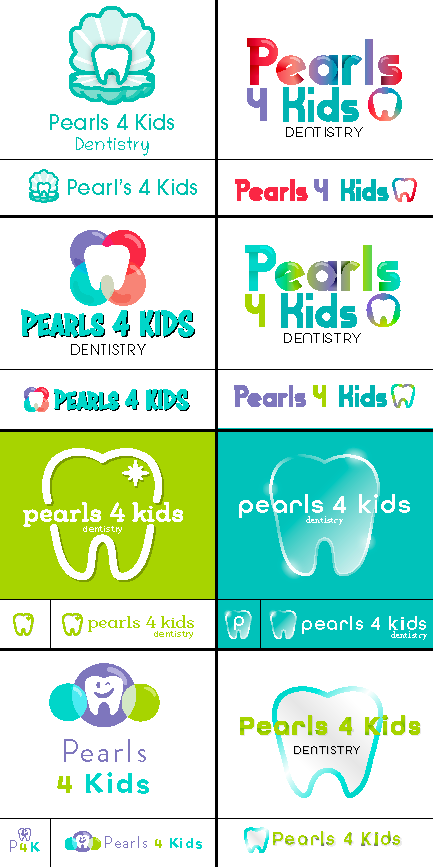
- Second Iteration - Although the team was impressed by the designs, they still felt like the Kidsperience Branding wasn't shining through enough. I decided to build a new batch of designs to see how I could incorporate Kidsperience branding a little more through colors and font choices.
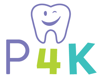
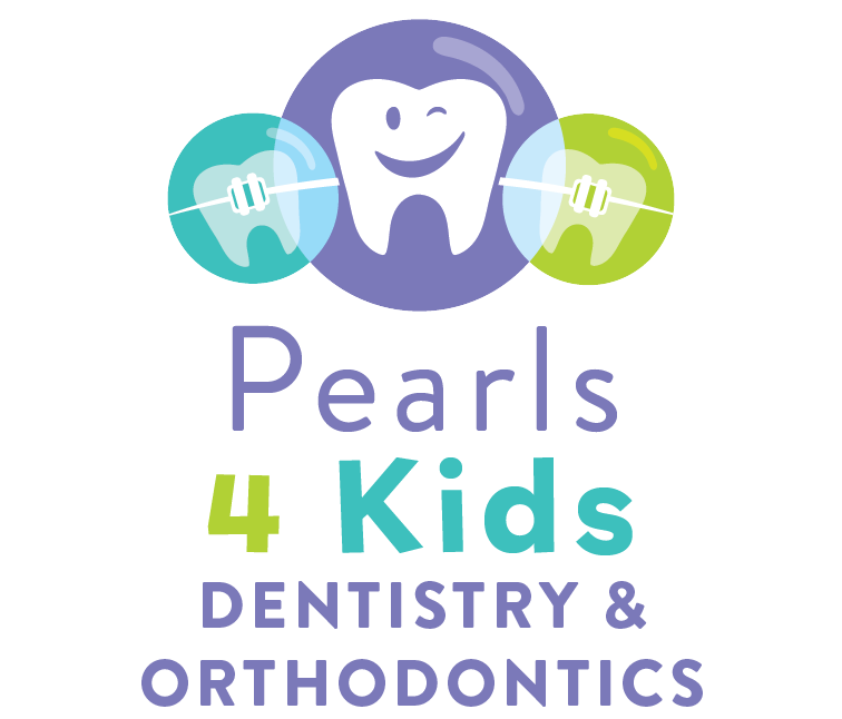
- Third and Final Iteration - Once the team saw the second batch of designs, the lower left design stood out the most. They loved the smiling tooth, and the bubbly playful "pearls" that surrounded it. I discussed what they would want me to add, such as the word "Dentistry", as well as any other icons or images to it, and about a day later, the final version of the logo was created!

After I had proven that I could design in a speedy timeframe, the team at Lone Peak requested I redesigned more logos. Below are a few more before and after comparisons of other logos I have recreated! The process is extremely similar to what I did for Pearls 4 Kids' logo, just a little quicker depending on how urgent the rebranding was!
Smiles 4 Kids Omaha - Before:

Smiles 4 Kids Omaha - After:
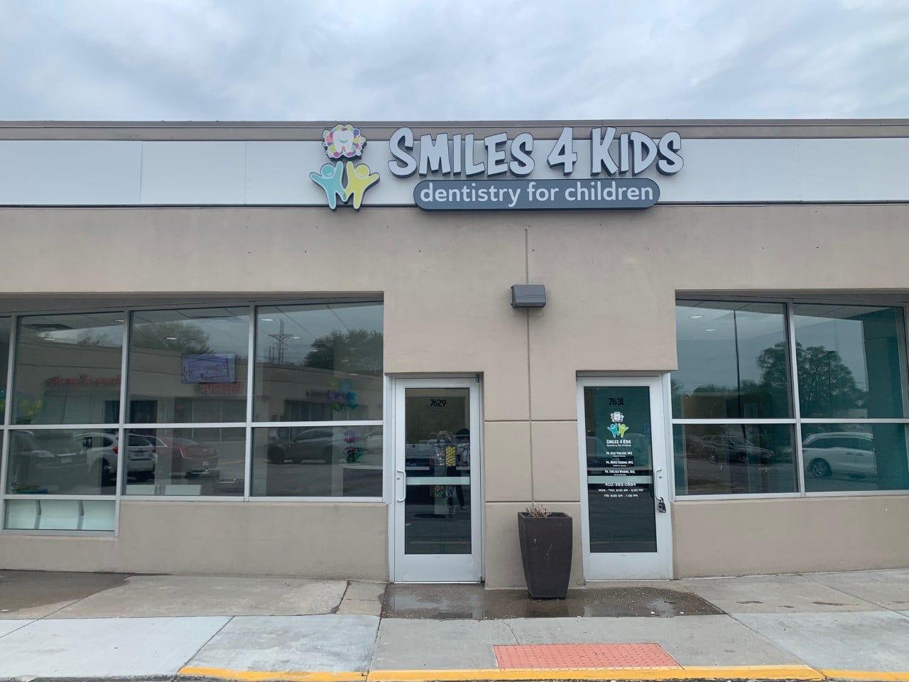
Children's Dentistry of South Omaha - Before:
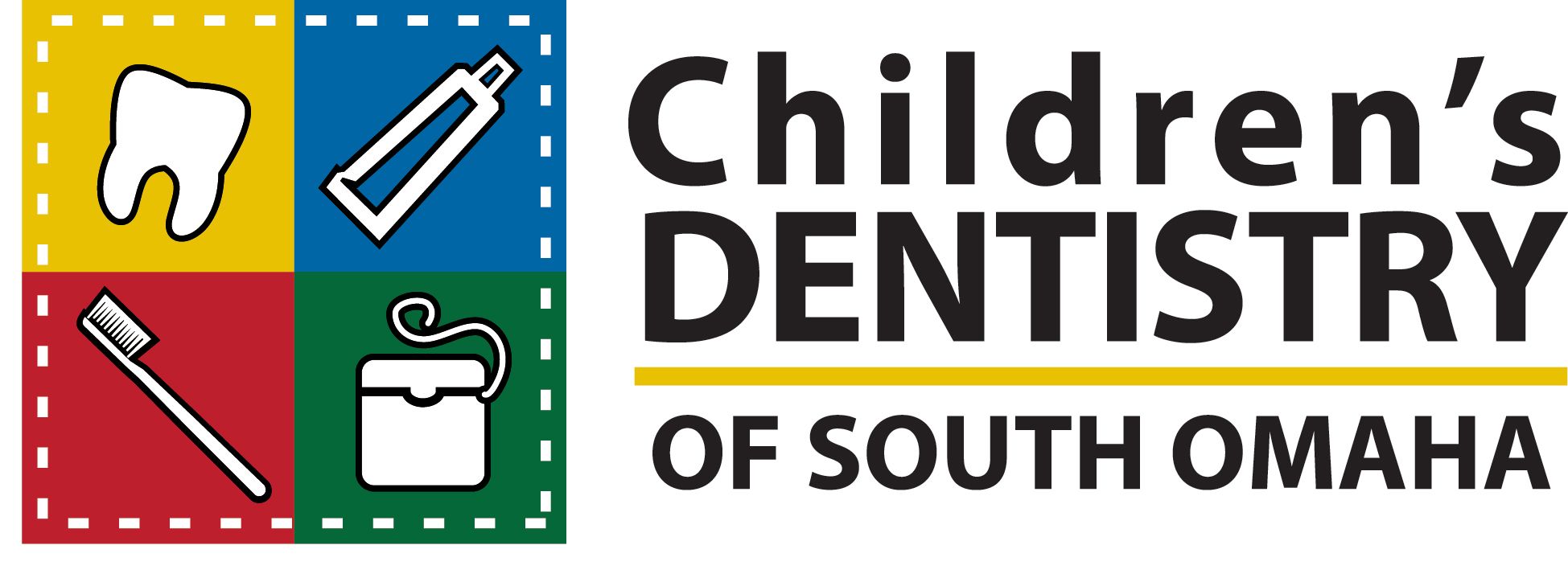
Children's Dentistry of South Omaha - After:

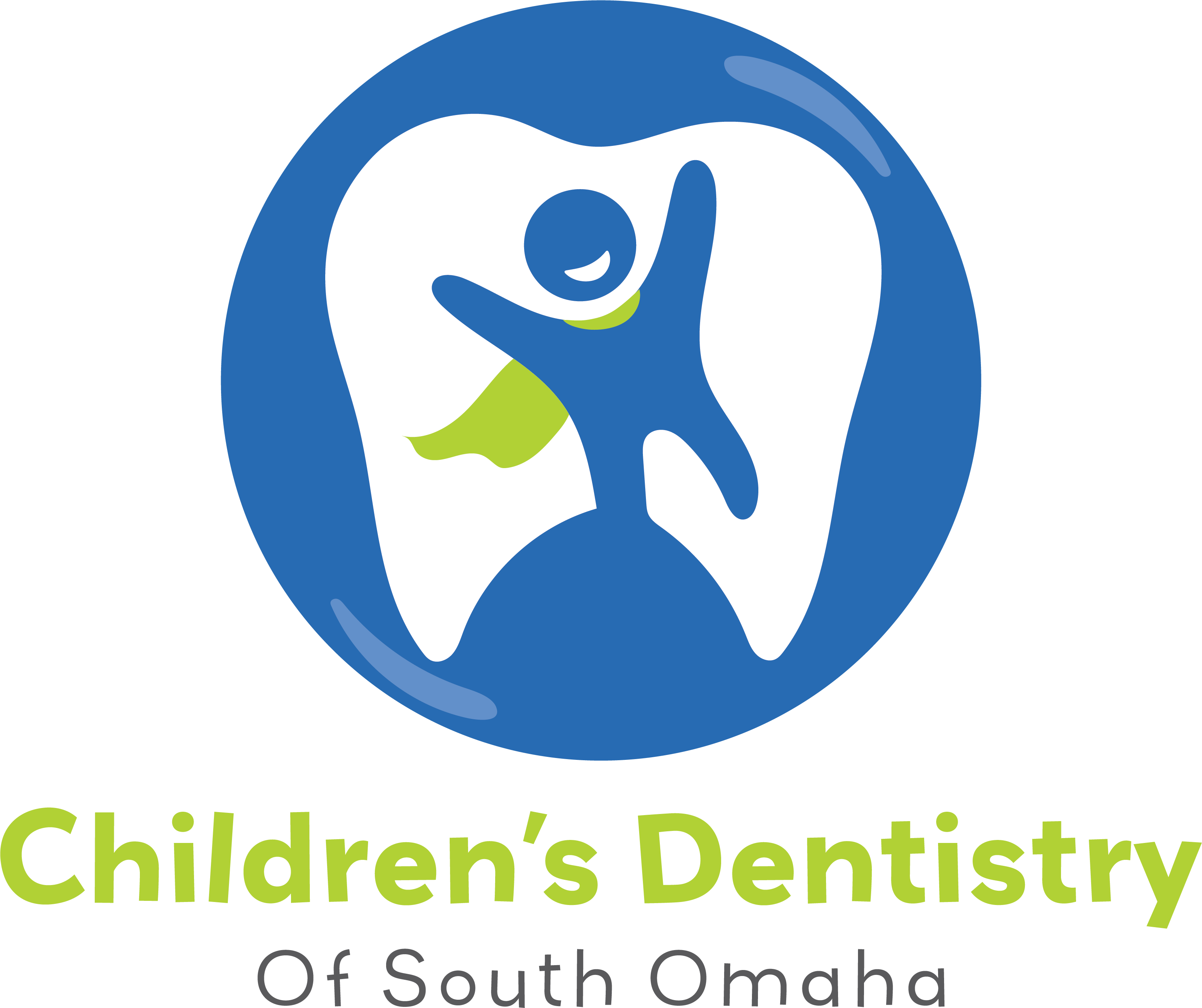
Smiles 4 Kids Nampa - Before:
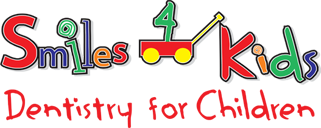
Smiles 4 Kids Nampa - After:

The wagon was a crucial element for the owner of the practice, so I had to keep it in the new logo. I converted it all into a more flat design, similar to what we have in a few other practices, but customized the design to their needs.
