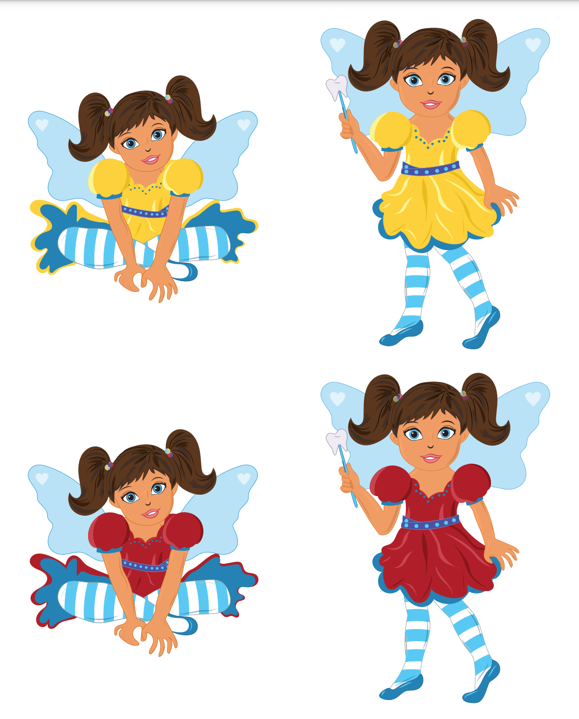
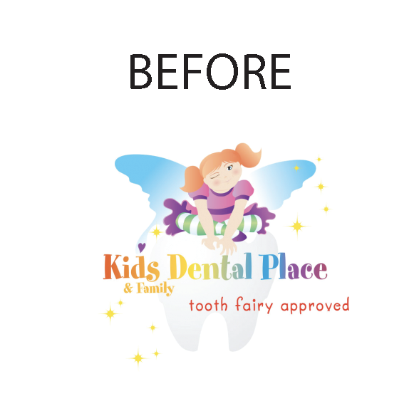
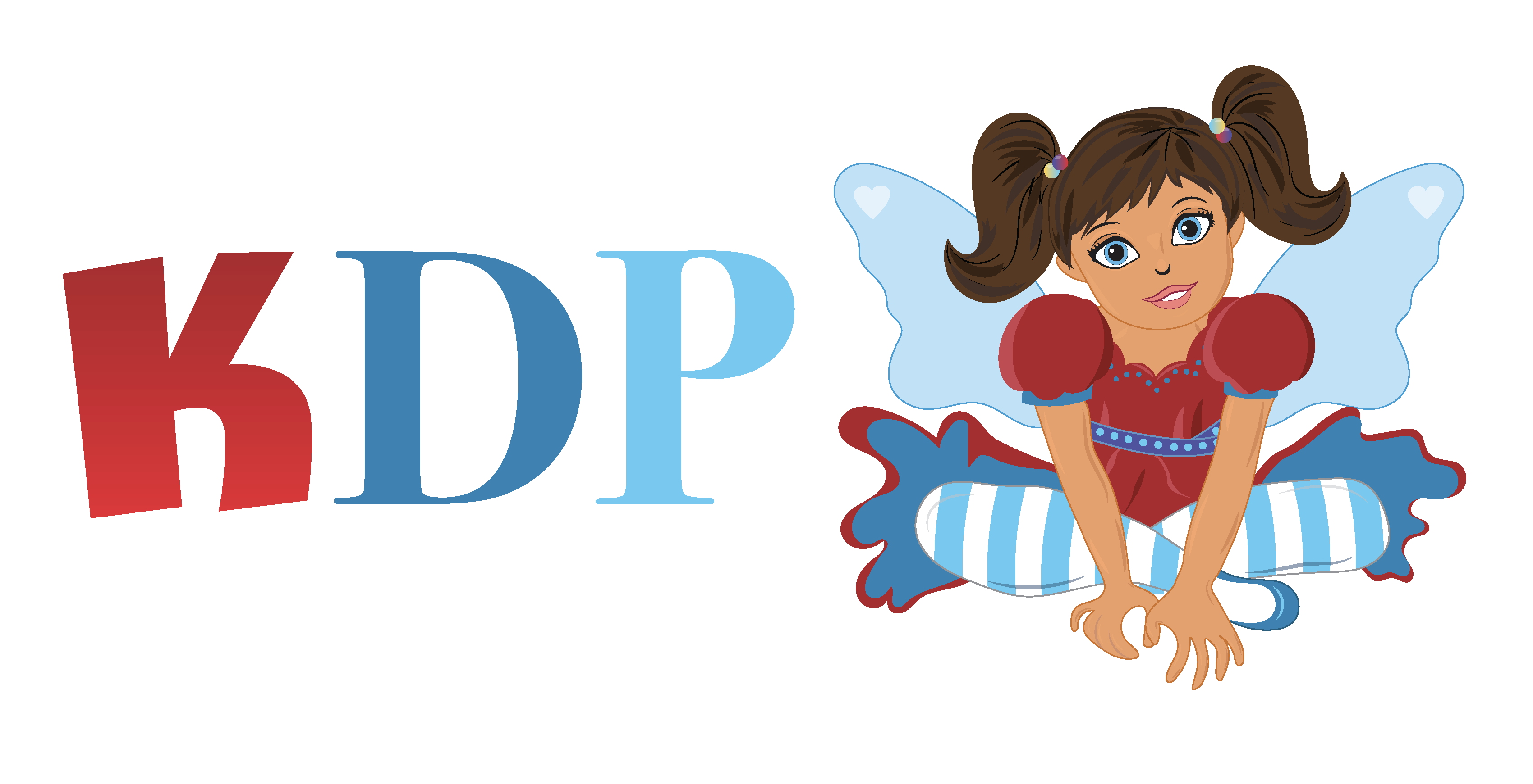
This was one of the largest-scale projects I have ever done! I was approached by a manager's colleague, who wanted to rebrand a chain of practices in California that needed to fit their overall family of characters and branding. The original design was a little outdated, but the client requested that I keep the tooth fairy mascot, just give her a refresh! It was very exciting to work with this company, even it was remotely.
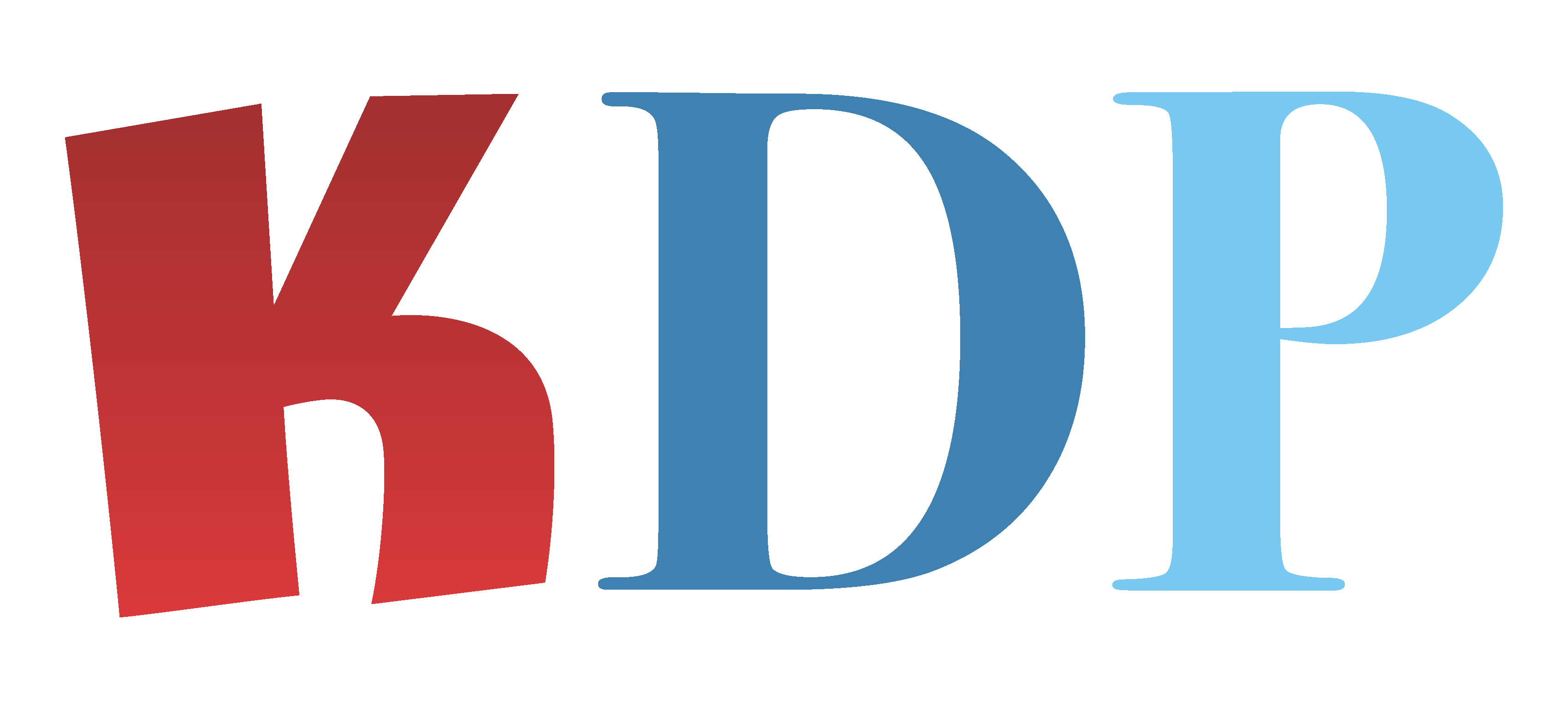
What KDP and TDP wanted to focus on were keeping brand colors - blue and red. The shades of red and blue they use across their practices needed to be a large part of the rebrand. Second, they also wanted to incorporate a smile shape in a creative way to the KDP logo. As you can see below, in the KDP logo, the "Kids" section is curved to resemble a smile, and add some playfulness.
As for TDP, they wanted it to tie into the KDP logo, but the client requested "Teens" to be a more handwritten/bold font to attract their older patients.
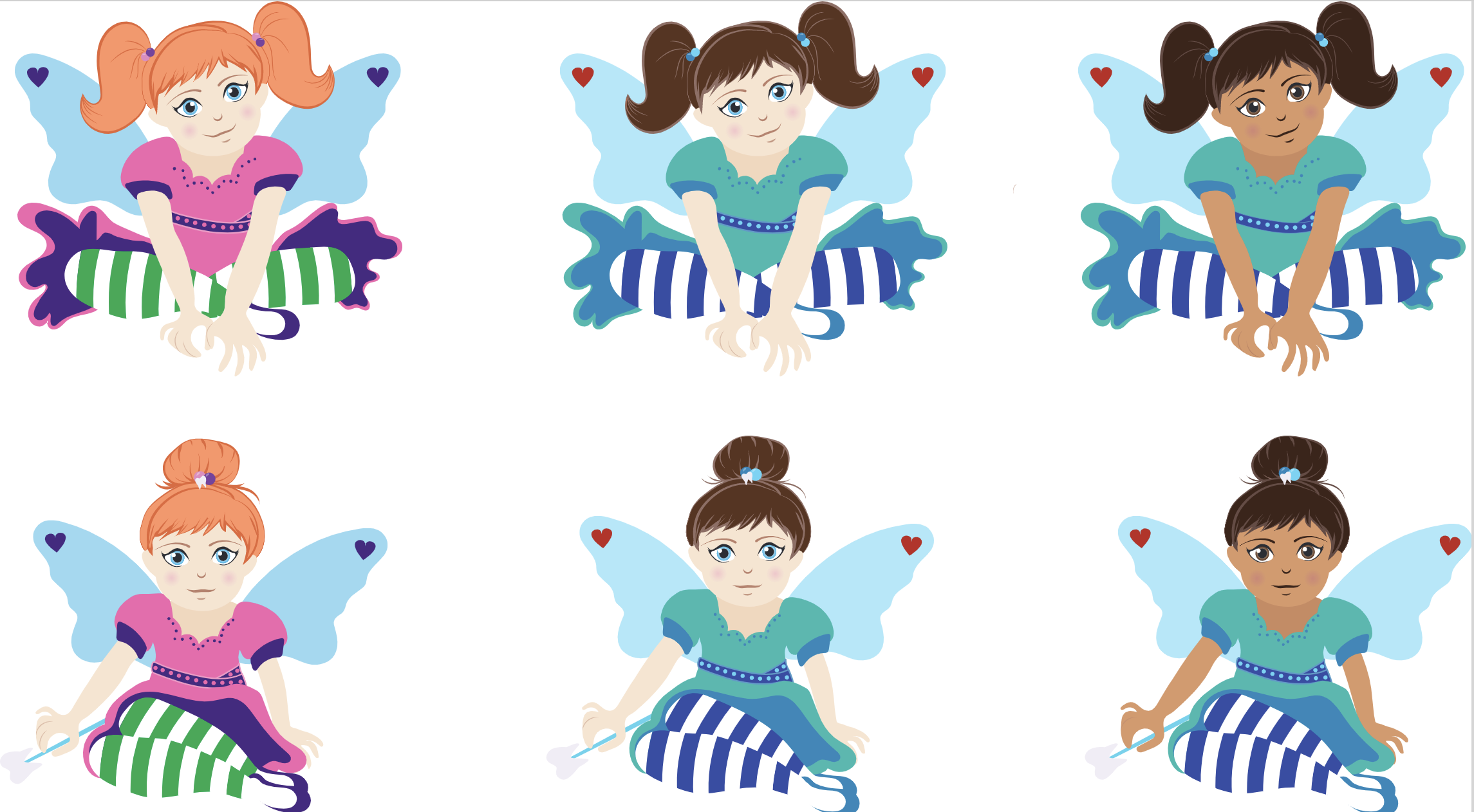
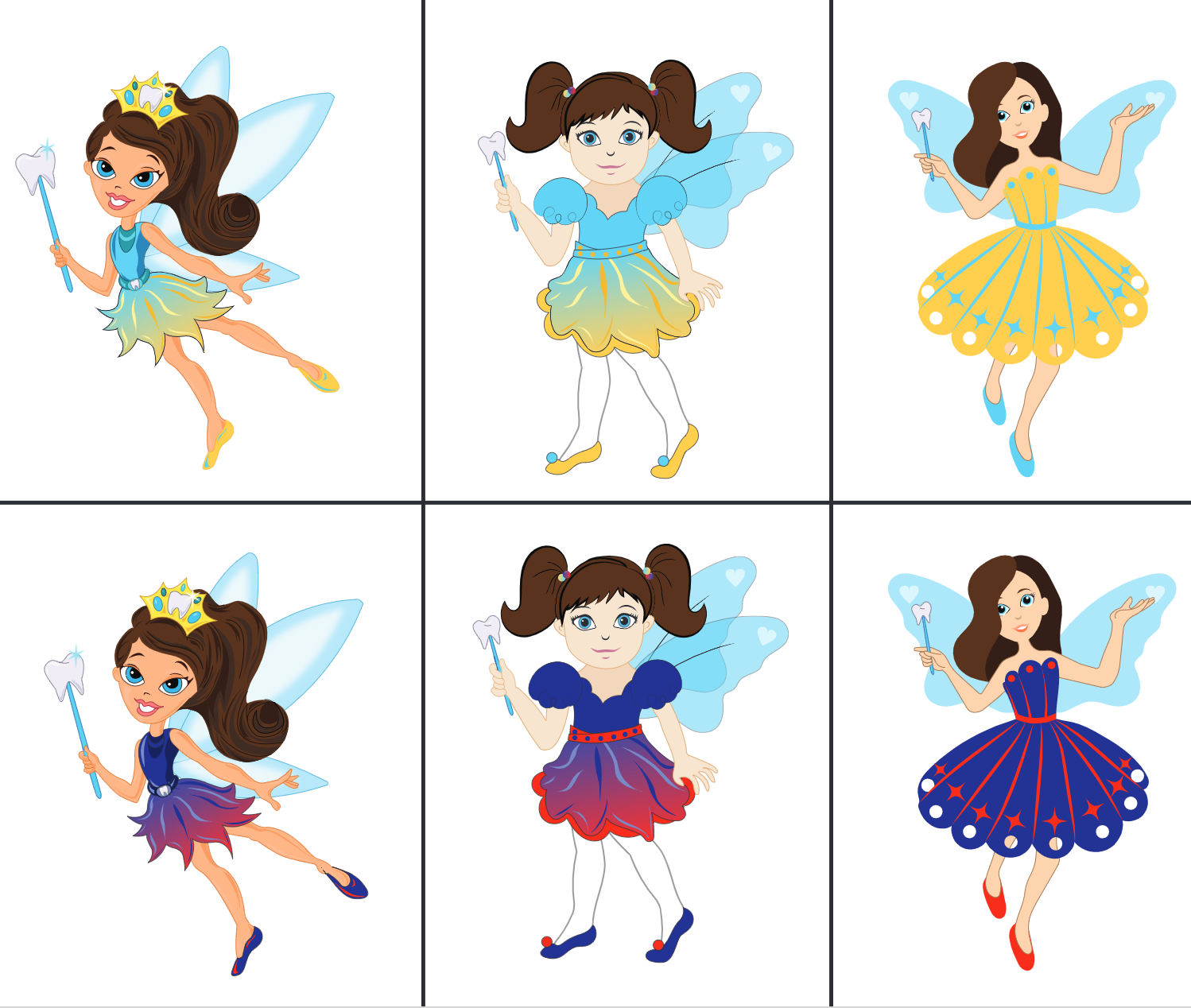
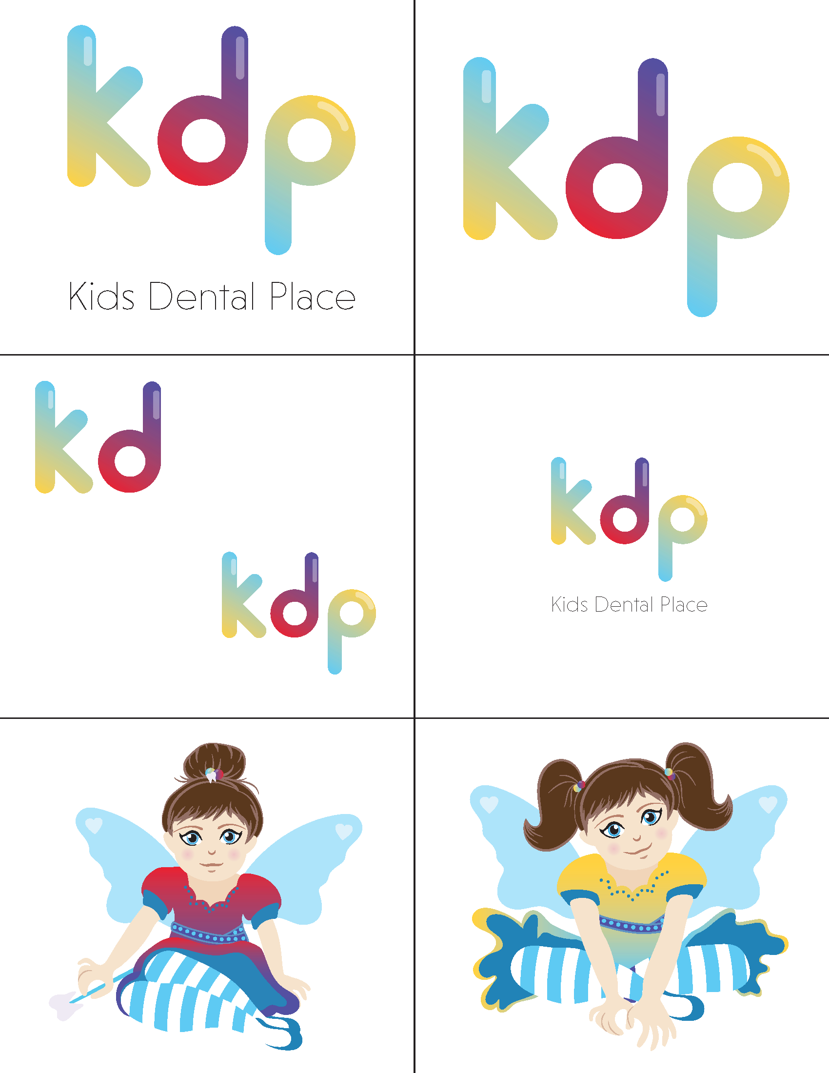
I cried tears of joy actually seeing my creations come to life, and know that so many people have probably viewed these commercials and seen the signage with my design is absolutely mind-blowing. This is probably one of the most humbling pieces of work that I am so happy to have in my portfolio. Please see the animated commercial below, and the final iterations of all the logos and mascot. Process snapshots are below as well!
Before:
After:


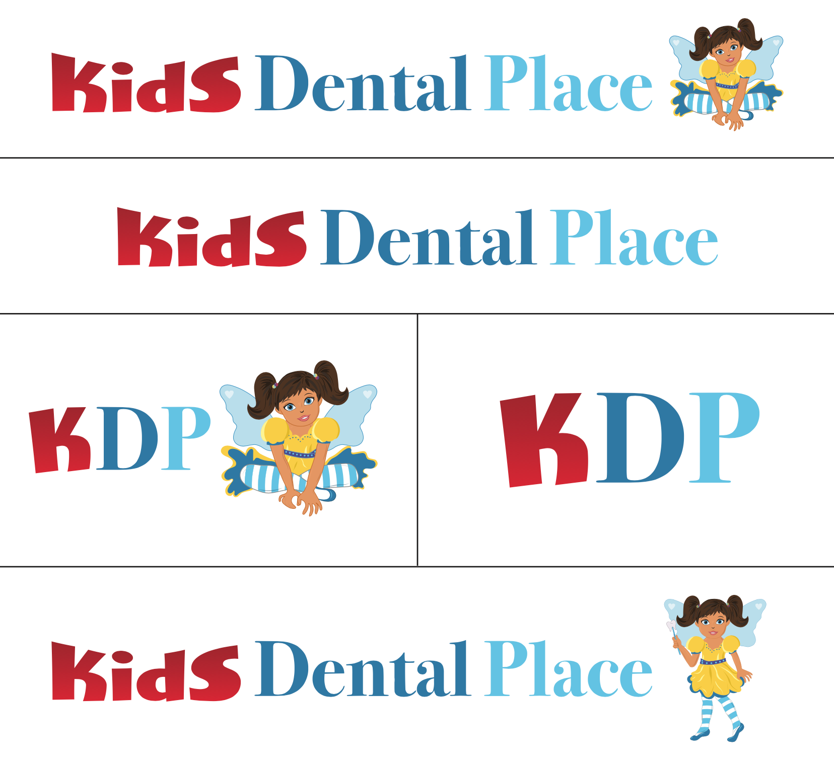

Progress Snapshots:
